Internal comms usually falls apart long before the message does. Most of the time, the issue isn’t what you’re saying, it’s how the design is helping (or hurting) the message land.
And while I know that you know design isn’t just about making things pretty, I wish more people knew just how much it actually does.
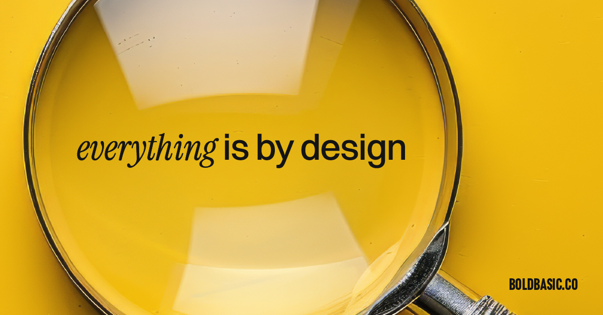
Design is the thing quietly doing everything behind the scenes.
It’s why you know where the toilets are in a crowded airport.
It’s why your favourite app feels like second nature.
It’s why a tube map makes sense at a glance.
The London tube map is the world’s best piece of information design, and I will not be told otherwise.
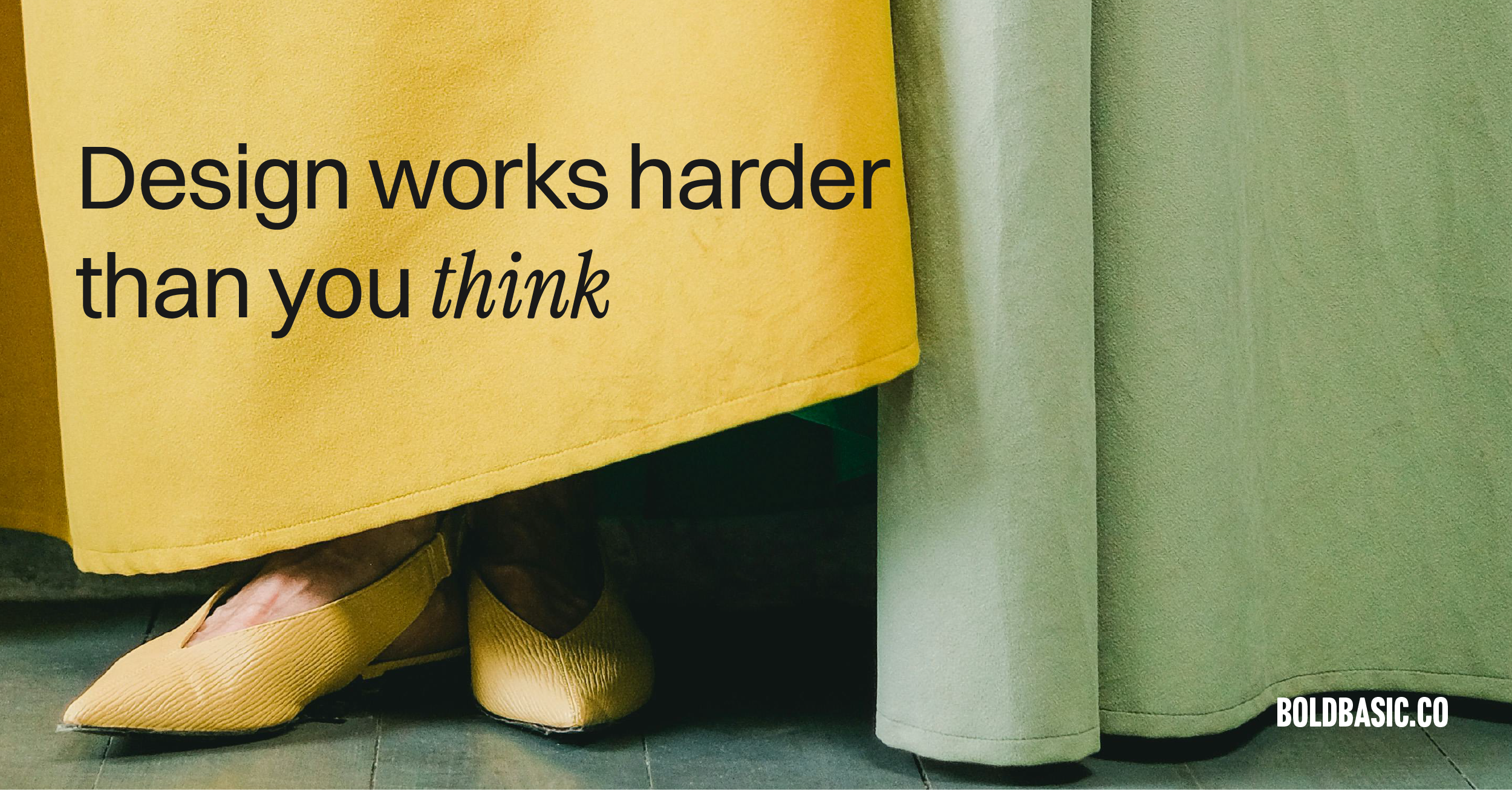
Design doesn’t always shout. It guides. It supports. It makes life smoother without you even noticing it.
And this applies far beyond airports and phone screens.
It matters more in the unsexy corners of your business than you think.
Think of it like the backstage crew of any good production.
You never see the coordination, the timing, the work — you just see the result.
Internal comms need that same level of invisible structure for the message to actually land.
Good design is the difference between a pitch deck that gets polite nods and one that gets actual buy-in. It’s the reason someone clicks through your e-learning page instead of zoning out ten minutes in. It’s why your new internal brand roll-out doesn’t die a slow, quiet death after the all-hands meeting.
Internal comms fail when they’re unclear, overwhelming, or visually chaotic. Design fixes that at the root. It helps people understand.
It gives shape to data, logic to ideas, and relevance to the work you’re trying to explain. Design reduces the cognitive load for the reader. And cognitive load — not budget, not talent, not attention span — is the biggest enemy of modern communication.
No one like or wants more decision fatigue.
And the work I do? It lives exactly in that space. The in-between. The “this is important but no one reads it” zone. The onboarding guide your HR team hasn’t updated since 2014. The 120-slide presentation your CEO keeps apologising for.
I take all of that and use design as a tool to make sure the people on the other side of the screen, table, or Zoom… actually get what you’re trying to say.
Design doesn’t just make things look good, it makes them work.
So, the next time you think, “This is too boring for design”, I want you to think again.
Because that’s where design shines the most. When your internal comms are designed well, teams actually read, understand, and act on what you’re trying to say.
I’d love to hear about that “boring” project you’re hiding in a dusty folder or that internal comms piece everyone avoids. We’ll make it “holy crap, I didn’t know it could look good and work!”