If you’ve ever wondered how to brief a designer, here’s the honest version: you don’t need perfection, you just need your real thinking on the page.
Bring your goals, budget, deadline. Everything else can be rough, scrappy or out of order.
The kind of work I do rarely starts with a neat brief. More often, it starts with too many ideas, half-built diagrams, and a Google Doc overflowing with jargon. It often starts messy.
That was exactly the case when I worked with Open Assembly (OA). OA is an advisory firm that guides companies in leveraging open talent models while serving as an accelerator to help open talent platforms expand and thrive. They wanted to create a global benchmark for companies adopting the open talent model. But first, they needed to explain what that model even was.
Because here’s the thing: when you’re trying to change how the world works (literally), you need more than a slide deck to shift a system.
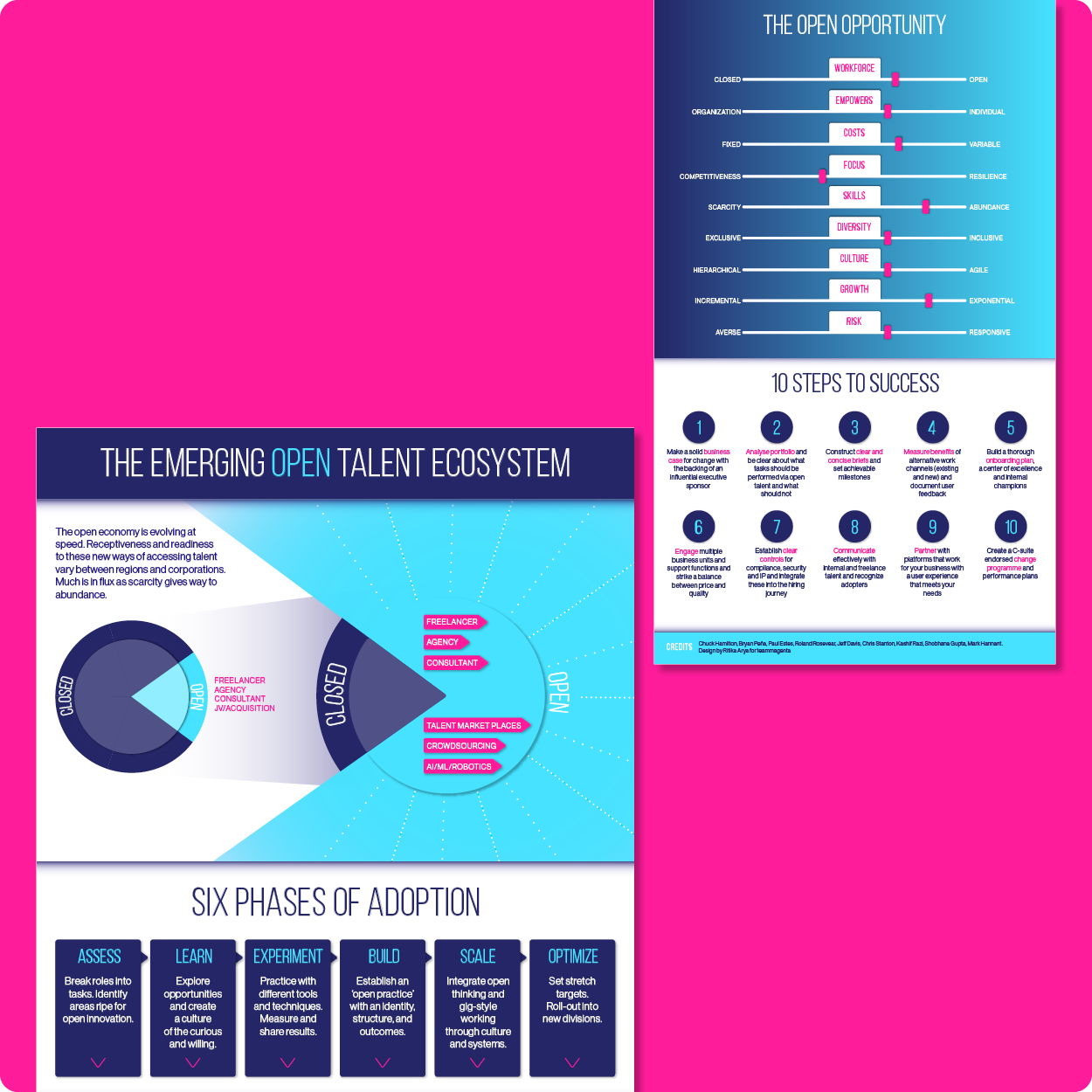
The problem: 6 different models, no clear picture
The open talent ecosystem, what many still call the “gig economy”, isn’t new. But it is misunderstood. And at the time, there were about half a dozen competing models trying to define it. Each with its own structure, logic, and visual language.
To the average stakeholder, it looked like a choose-your-own-adventure gone rogue.
OA wanted something better. Something that gave this vast, decentralised world some actual shape, and made it make sense. For business leaders. For policy makers. For anyone trying to engage with this future-of-work model.
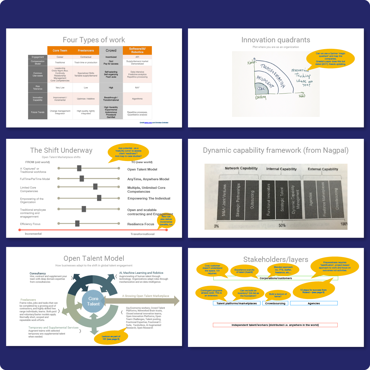
What I did: simplified, structured, and designed for growth
With minimal brand guidelines and maximum ambiguity, my job was to take all that complexity and turn it into a single, unified framework. One that was adaptable, one that was easy to use, and one that could act as a foundation, not just a one-off.
This meant:
• Distilling multiple models into one cohesive visual.
• Designing a system flexible enough to evolve over time, much like the open talent ecosystem itself.
• Making sure it worked across internal comms, external decks, and future strategy docs (and of course, it looked bloody brilliant).
I asked questions. Flagged inconsistencies. Reframed confusing concepts.
The final output was a clear, elegant visual that defined the open talent ecosystem – not just as it is today, but as it could grow tomorrow.
It is a system, a model, a framework – one that can be adopted by any business and tailored to their goals.
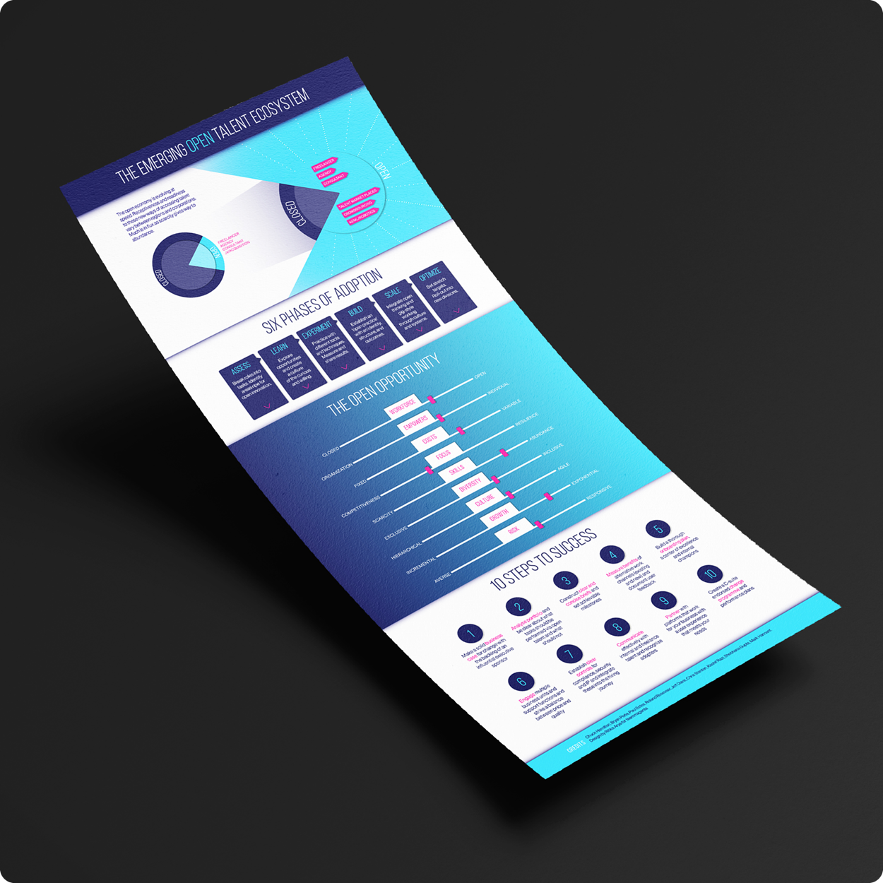
The result: a visual benchmark for a global movement
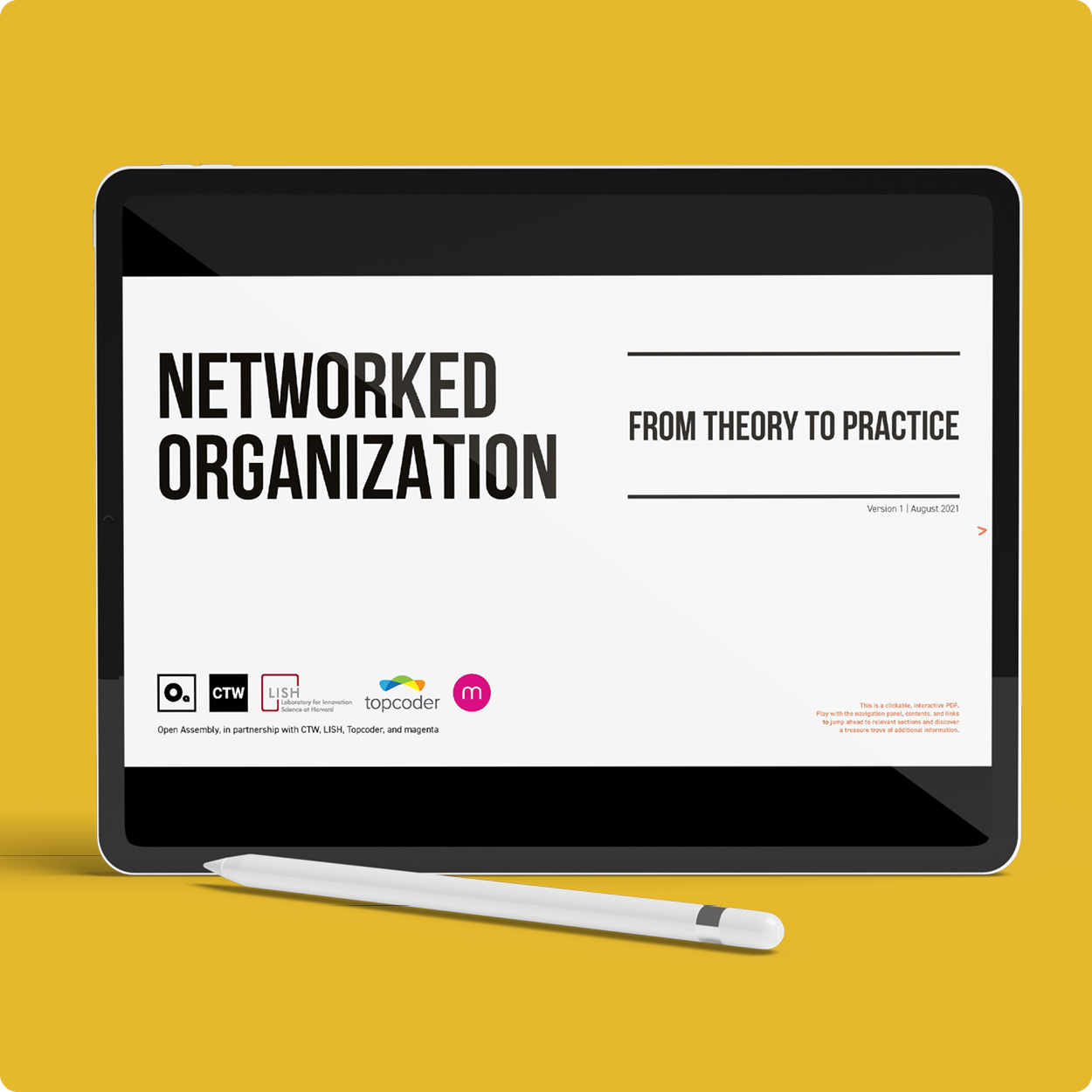
That single infographic became the starting point for co-creating the Networked Organisation Playbook, now considered a global benchmark in the open talent space.
It gave organisations a shared language. A visual system. A way to get internal and external stakeholders on the same page (finally).
Because when you’re dealing with emerging models and complex ecosystems, design isn’t a “nice to have.” It’s the thing that makes the whole idea legible.
The hard lift of design is to create order from disorder. The hard lift is simplification.
Kind words from the wonderful John:
“Ritika has that rare mix of strategic thinking and design craft — able to take dense, complex ideas and turn them into something clear, engaging, and genuinely useful. Her work on the Open Assembly playbook and infographic went far beyond design; she understood the material, asked the right questions, and delivered a system that feels both professional and human. Ritika’s brilliance lies not just in her expertise, but in how collaborative, responsive, and effortless she makes the process. She’s reliable, quickly became a trusted partner, and someone I’d recommend to anyone who wants world-class design.“
John Winsor
Founder, Open Assembly • Executive Fellow, Harvard Business School • Author
Note: I created this piece while I was the creative director at magenta.
TL;DR?
How to brief a designer? Start with what you’ve already got.
Bring your chaotic, complicated, “everyone’s-got-a-different-version” kind of information and I’ll turn it into something that makes sense and works. Not with more charts. Not with another 40-slide deck. But with thoughtful design that brings structure, clarity, and just enough elegance to keep people engaged.
Unsexy by design? Absolutely.
Essential for business? Even more so.