We all know what respect sounds like. It’s the follow-up email. The prepared agenda. The person who shows up on time. But respect isn’t just in what you say, it’s in how you present things.
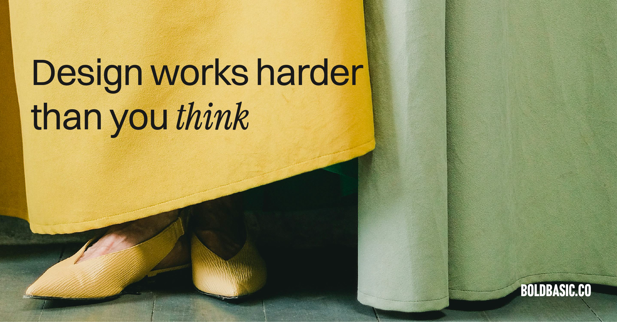
That’s why design is important in business. Because showing up well isn’t just about you, it’s about the work you put in front of people.
And design can be your secret sauce.
I don’t just mean having a nice logo. Or choosing fonts that don’t look like they belong on a teenager’s résumé. I mean investing in design that makes things clear, usable, and unmissable. Design that helps people read, understand, and engage; without squinting, scrolling endlessly, or dying a little inside.
When you send someone a pitch, a report, a proposal and it’s 17 pages of Arial size 9 with mismatched headings and screenshots that look like they were taken in a panic; what you’re actually saying is, “This wasn’t important enough to put effort into.”
And if you didn’t think it was important, why should they?
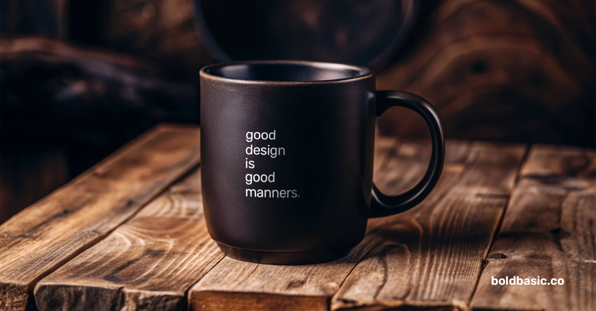
Good design is good manners
You wouldn’t hand someone a coffee in a cracked mug. So why hand over a 6-figure proposal in a Word doc that looks like it was last updated in 2004?
Design shows you care about the person on the other end, about the thing you’re trying to communicate, and about the opportunity itself. You’re saying, “This matters. You matter.” And that’s the proposal they actually sign, the pitch they remember, the training that sticks.
In business comms, attention is currency
And your audience is busy. They don’t have time to “figure it out” or read between the lines. Design does the heavy lifting by creating visual structure, reducing friction, and guiding them to what they actually need to know.
This is even more important with internal design. When you slap together training guides, onboarding decks, or internal comms, it tells your team, “We just need to tick a box.”
But good design? It says, “We want you to understand this. We want you to enjoy this. We respect your time.”
Respect isn’t loud, it’s deliberate
It’s a layout that makes sense. A diagram that doesn’t make you cry. A deck that looks like someone actually thought about it for longer than a minute. It’s the difference between, “we threw this together last night” and “we care about getting this right.”
Because when your materials look like you care, people start to care too. And at the end of the day, isn’t that the whole point?
So if you’re weighing up why design is important in business, remember this: sometimes the quality of your work is only as strong as the way it shows up.